Threats at a Glance: SOC Threat Intelligence Dashboard Case Study
A real-time SOC dashboard that turns noisy signals into clear action.
I designed a dark-themed Threat Intelligence Dashboard for a SOC team. It brings scattered security data into a single calm view so analysts can see what’s happening, how bad it is, where it’s hitting, and what to do next.
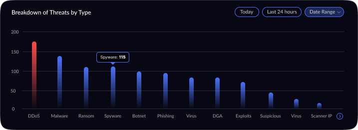
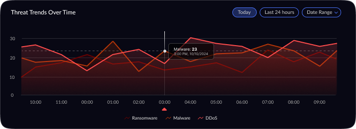
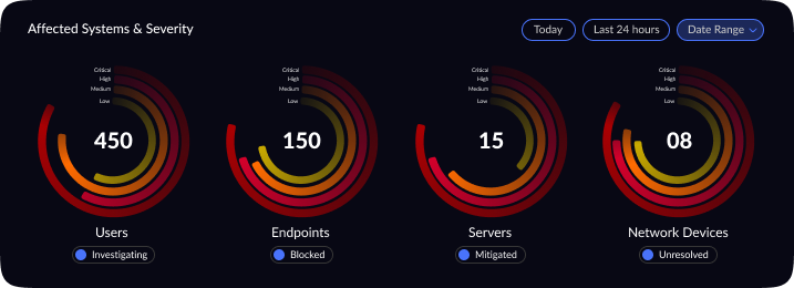
Project Overview: This project involved updating a cybersecurity threat intelligence dashboard originally built for senior Security Operations Center (SOC) analysts. The dashboard provides a centralized view of network threats — showing total alerts, malware incidents, DDoS attacks, threat severity distribution, a global threat map, top affected entities, and real-time trends. While the original design delivered rich, high-level summaries for experienced analysts, it proved overwhelming for new analysts. The goal was to subtly refine the UX/UI to better suit junior SOC analysts, improving clarity and ease-of-use without drastically changing the core functionality (network threat detection and intelligence).
Why this matters
Security teams are overloaded with data. During incidents, there’s no time to process it all they need a clear surface. This dashboard gives a fast, trusted view.
My role
UX Lead & Visual Designer
The problem (in plain words)
Threat data was scattered across tools. People were context-switching, missing the big picture, and losing time. We needed one screen that says:
What’s happening now?
How bad is it?
Where is it coming from?
What is impacted?
Project Goal
Reposition the threat intelligence dashboard’s user experience for junior SOC analysts without losing its value to senior analysts. This meant enhancing clarity, prioritization, and guidance in the UI so that a newcomer could confidently interpret the data. Crucially, the core purpose monitoring and investigating network threats remained unchanged.
Key objectives included:
Reduce Information Density: Streamline the layout and remove visual clutter so that important metrics stand out.
Improve Visual Hierarchy: Re-organize and size elements so that critical data grabs attention first, while secondary information is less prominent.
Clarify Iconography & Terminology: Use intuitive icons and plain language labels. Technical terms needed brief explanations or simpler alternatives for clarity.
Maintain Functionality & Depth: Ensure that no key insight or capability was removed. Senior analysts should still find all the data they expect, just presented in a cleaner, more digestible format.
Who it’s for
SOC analysts working in shifts, making fast decisions under pressure
Design Process
Research & Analysis: I began by studying the SOC domain and gathering requirements from cybersecurity stakeholders. This included reviewing SOC analyst workflows, pain points, and typical metrics they track. For instance, it was clear that metrics like total threats, incident types, and severity levels are fundamental for situational awareness. Industry best practices were also considered such as using geospatial visuals for global threats and highlighting critical vs. low-priority incidents. This research ensured the dashboard’s content and functionality would truly address the users’ needs.
Conceptualization & Wireframing: With the requirements in mind, I sketched out several layout concepts. The emphasis was on information architecture and visual hierarchy. I decided on a top section for summary statistics, a center area for live threat visualization, and side panels for trends and breakdowns. Low-fidelity wireframes were created to iterate on how to group related data (for example, keeping all threat-type analytics in one section, and all asset impact information in another). Through feedback and iteration, the layout evolved to maximize clarity ensuring that at any given moment, an analyst could scan the dashboard and pinpoint what needs attention first.
Visual Design & Refinement: Once the layout was validated, I moved into high-fidelity design. I applied a dark theme, which is common in SOC interfaces to reduce eye strain and provide high contrast for color-coded alerts. Visual hierarchy was refined by using size and color: the most critical numbers (like Total Threats) are large and immediately visible, and critical severities are indicated with urgent colors (e.g. reds or oranges) against the dark background. I carefully chose visualization types to best represent each data point for example, a radar chart for severity distribution (to quickly show the spread of threat severities), and a line chart for threat trends over time (to easily spot surges). Icons and minimalistic illustrations were added to the summary panels (e.g. a malware symbol next to Malware Incidents) to aid recognition. Throughout the visual design phase, I iterated on details like legend readability, color contrast, and ensuring that even at a glance from a distance (as is common with wall-mounted SOC displays), the data remains legible. The design was polished through multiple refinements, aiming for a balance between aesthetics and practical clarity.
Outcome (qualitative)
In reviews and walkthroughs, analysts could scan the screen in seconds, call out top risks, and jump to the right area without hunting. The dashboard tells a single story: what’s happening, how bad it is, where it’s hitting, and what’s affected.
What I Learned
Good security UX isn’t about showing everything; it’s about showing the right thing first — then making the rest one click away.